


Related resources
A better way to visualize data relationships: A new diagram user experience
Share on:

We are excited to unveil the completely redesigned user interface for Collibra Diagrams, crafted to bring exceptional clarity and a modern, intuitive experience to data visualization. This major update introduces a more visually consistent look and feel that aligns with the entire platform, coupled with significant performance enhancements for faster loading and smoother navigation. With clearer nodes, improved exploration tools and enhanced readability, users can now effortlessly trace data relationships, perform impact analysis, and understand their data landscape at a glance.
How the new diagram UI helps
Navigating a complex data landscape can feel like trying to read a tangled map without a legend. Tracing data lineage or performing impact analysis often involves deciphering slow-loading, visually inconsistent diagrams that obscure more than they clarify, leading to user frustration and a lack of data trust. That’s why we’ve completely redesigned our Diagrams UI, transforming this experience from a source of complexity into a tool for clarity. Our goal is to turn that tangled map into a clear, interactive story, empowering you to see your data ecosystem with the confidence and precision you need.
Problems it solves
The new diagram UI helps solve some of the greatest data challenges such as:
- Disjointed and inconsistent user experience: Previously, users were redirected to a separate, outdated UI window when viewing or editing an asset's diagram. This created a visually inconsistent and cumbersome experience, forcing users to navigate back and forth between the old and new UIs. The new UI diagram provides a seamless and visually consistent user experience by integrating diagrams directly into the new UI, allowing users to maintain context on the asset's primary information page
- Manual and inefficient diagram description creation: The previous process lacked a way to easily generate descriptions for diagrams. The new UI introduces an AI-powered description generation feature. This allows users to automatically create descriptions for their diagrams based on the included assets, appearing when they click the "Capture a Picture" button. This feature aims to enhance documentation and clarity, serving as a valuable asset for marketing effort
How the new diagram UI works
Beyond basic viewing, the new UI diagram introduces advanced features designed to streamline user workflows. A key innovation is the AI-powered description generation capability. This feature allows users to automatically create descriptions for their diagrams based on the assets included, which appear when the "Capture a Picture" button is clicked, enhancing documentation and serving as a valuable asset for marketing efforts. The editing experience has also been significantly improved and is now performed directly within the new UI, preventing users from being redirected to the old UI when creating or updating diagram views. This includes specific technical enhancements such as inline edit mode, state synchronization between diagram views and forms, and the use of the CodeMirror component for text mode (JSON). The development also incorporated feedback from both the private beta program and internal stakeholders to ensure continuous refinement of the user experience.

AI-Powered Description Generation: The UI features an AI “magic button” that automatically generates descriptions for diagrams

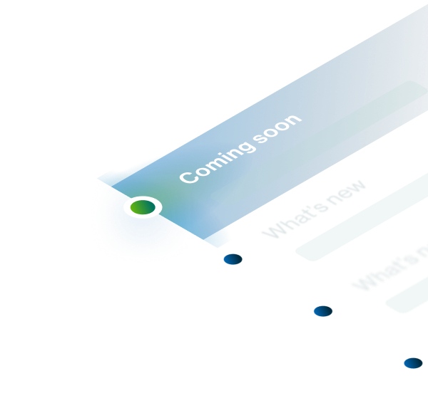
Improved user experience: Updated, enhanced user Diagram interface
Why you should be excited
For data stewards, it specifically helps them visualize data relationships with a seamless and visually consistent user experience, aiding in understanding and accountability for governance processes. Data stewards will also benefit from an improved diagram editing experience directly within the new UI, eliminating the previous need to be redirected to an outdated UI window, thereby improving usability and efficiency. Furthermore, the new AI-powered description generation feature allows for automatic creation of diagram descriptions based on included assets, a valuable asset for enhancing documentation and marketing efforts.
Regular Consumers of Diagrams, will be thrilled with the consistent and modern design, no longer encountering a disjointed experience due to redirects to the old UI. They will experience boosted performance, with page load times reduced by 2 to 5 seconds, leading to quicker access to critical data insights. The addition of a new "Explorer" button provides immediate access to the explore mode, serving as a "small delighter" that streamlines their data exploration.


Key use cases
Our new diagram user experience helps you:
- Regulatory compliance: For regulated industries like banking, providing a clear, auditable trail of data is not just a best practice—it's a requirement. Business lineage diagrams give you a complete, top-down view of where sensitive data is processed, shared, and stored, making it easy to document and validate data flows for regulations like BCBS 239. To further streamline this, new capabilities like AI-generated descriptions can automatically explain a diagram's context and content, providing the transparency and auditable documentation needed to face any compliance check with confidence
- Proactive impact analysis: When making changes to data sources, adjusting calculation rules, or migrating data, business lineage diagrams help assess the potential impact on downstream systems, data, and reports. The new Diagrams UI transforms proactive impact analysis for critical system changes, such as deprecating a database column. Now, a data engineer can apply advanced filters directly to the diagram to isolate critical assets, like certified BI reports, and hover over them to see rich preview cards with owner details for immediate follow-up, turning a risky manual exercise into a reliable process that prevents production outages
- Root cause analysis: When a data quality issue or an anomaly appears in a report, the clock is ticking to find the source. Lineage diagrams serve as a powerful diagnostic tool for this exact scenario. By visually tracing the data's journey backward, data analysts and engineers can quickly pinpoint the source system or transformation process where the issue originated, cutting down on investigation time and allowing them to fix the root cause faster
- Report certification: For a report to be trusted, its underlying data must be transparent and traceable. Business lineage diagrams are fundamental to the report certification process. They provide the clear evidence needed to review all data sources and transformations, allowing you to formally certify that a report's data is accurate and reliable, which builds confidence and encourages wider use of your key analytical assets

Contextual Display: Diagrams now open directly within the context of the asset page, ensuring users maintain visibility of the asset's primary information and offering a more intuitive and efficient experience
Key takeaways about new UI diagram
Collibra’s enhanced diagrams play a key role in supporting Collibra's 'Power of One' theme by creating a unified and seamless user experience within the platform. By integrating diagrams and their editing capabilities directly into the new UI, Collibra provides a single, cohesive command center for data and AI governance, which enhances usability and efficiency, and reduces page load times.
Catch up on our June launch announcements by watching the full recording here. Learn about:
- The latest innovations in Collibra’s data and AI governance platform
- How to optimize diagram usability with new UI diagrams
- How to get started
Read our documentation to learn more.
-

Meredith Bailey
Meredith Bailey
Senior Product Marketing Manager
Collibra
-

Zuzana Zatrochova
Zuzana Zatrochova
Senior Product Manager
Collibra
-

Guillaume Kinif
Guillaume Kinif
Senior Manager, Software Engineering
Collibra
Share on:
Related articles
Data GovernanceFebruary 14, 2025
Why we are the data and AI leader for you
Data GovernanceJuly 28, 2025
Your new shortcut to trusted data: Collibra’s two-way Slack Integration

Data GovernanceMay 24, 2022
The journey to data catalog and governance success: A customer perspective

Data GovernanceOctober 12, 2023
Improved user provisioning leads to calmer seas and smoother sailing
Keep up with the latest from Collibra
I would like to get updates about the latest Collibra content, events and more.
Thanks for signing up
You'll begin receiving educational materials and invitations to network with our community soon.